Tutorial 4: Web Design Using HTML and CSS3 & Update and Delete Methods on Data
Platform-Based Programming (CSGE602022) — organized by Faculty of Computer Science, University of Indonesia, Odd Semester 2025/2026
Learning Objectives
After completing this tutorial, students are expected to be able to:
- Understand the structure of HTML5 tags
- Know various types of HTML5 tags
- Understand CSS syntax
- Introduction to CSS frameworks, namely Bootstrap and Tailwind
- Understand the concept of static files in Django
- Understand the use of selectors in CSS
- Understand the implementation of update and delete in Django
- Perform Django styling with Tailwind
Introduction to HTML
HyperText Markup Language (HTML) is a standard markup language for documents to be displayed in web browsers. HTML defines the structure of website content.
Please explore HTML independently using the following reference.
The difference between HTML and HTML5 can be read in the following reference.
Introduction to CSS
What is CSS?
Cascading Style Sheets (CSS) is a language used to describe the appearance and format of a website written in markup language (such as HTML). CSS is useful for making website displays more attractive.
To learn the difference between CSS and CSS3, you can read the following reference.
How to Write CSS
In general, CSS can be written in the following form:
selector {
  properties: value;
}
Please explore CSS independently using the following reference.
There are three types of CSS writing methods:
- Inline Styles
- Internal Style Sheet
- External Style Sheet
Please explore these three types of CSS independently using the following reference.
Note that if you create an External Style Sheet type, you need to add the {% load static %} tag to your HTML page. For example, like the code snippet below:
{% load static %}
<html>
  <head>
    <title>Using External Style Sheet</title>
    <link rel="stylesheet" href="{% static 'style.css' %}" />
  </head>
  <body>
    <div>
      <h1>CSS is fun! :D</h1>
    </div>
    <div id="main">
      <div>
        <p>This is Tutorial 4</p>
        <h1><a href="">Awesome</a></h1>
        <p>Easy tutorial</p>
      </div>
    </div>
  </body>
</html>
This happens because CSS is a static file in Django. Static files will be explained in the next section.
Additional Notes
If there is more than one style defined for an element, the style that will be applied is the one with higher priority. Here is the priority order, with number 1 having the highest priority:
- Inline style
- External and internal style sheets
- Browser default
Static Files in Django
In the Django framework, there are files called static files. Static files are supporting files for HTML on a website. Examples of static files are CSS, JavaScript, and images.
Settings for static files are located in the settings.py file:
...
# Static files (CSS, JavaScript, Images)
# Documentation: https://docs.djangoproject.com/en/5.1/howto/static-files/
STATIC_URL = '/static/'
STATIC_ROOT = BASE_DIR / 'static'
...
In settings.py, there are:
STATIC_ROOTwhich determines the absolute path to the static files directory when running thecollectstaticcommand on the project.STATIC_ROOTis useful for providing a path to static content in production access (DEBUG=Falseinsettings.py)STATIC_URLwhich is a publicly accessible URL to obtain these static files. For example:http://localhost:8000/static/image/example-image.png
The collectstatic command is a command to collect static files from all apps to facilitate access for all apps.
A more complete explanation of static files can be read in the following reference.
CSS Selectors
In this tutorial, we will learn about three types of selectors: Element Selector, ID Selector, and Class Selector.
-
Element Selector
Element Selector allows us to change properties for all elements that have the same HTML tag.
Example of using Element Selector:
<body>
  <div>
    <h1>I'm h1 guys</h1>
    <h2>I'm h2 guys, different from h1 :D</h2>
  </div>
  ...
</body>
We can use elements as selectors in CSS file. Element selector uses format [element_name] (without being prefixed by a symbol)
h1 {
  color: #5bc933;
  font-family: "Times New Roman";
  font-style: normal;
} -
ID Selector
ID selector uses ID on tags as its selector. ID is unique within one web page. ID can be added to HTML template pages.
Example of using ID Selector in HTML template:
<body>
  <div id="header">
    <h1>Playing with ID header</h1>
  </div>
  ...
</body>
Then, we can use that ID as a selector in CSS file. ID selector uses format #[id_name] (always prefixed with #)
#header {
  background-color: #a3b90e;
  margin-top: 0;
  padding: 20px 20px 20px 40px;
} -
Class Selector
Class Selector allows us to group elements with the same characteristics.
Example of using Class Selector in HTML template:
...
<div id="main">
    <div class="parent_content">
        <p class="date">Date September 9, 2024</p>
        <h2><a href="">Subject: PBP Fun</a></h2>
        <p id="content_1">PBP material is very fun!</p>
    </div>
    <div class="parent_content">
        <p class="date">Date September 10, 2024</p>
        <h2><a href="">Subject: PBP Review</a></h2>
        <p id="content_2">To be more awesome, I review PBP material</p>
    </div>
    <div class="parent_content">
        <p class="date">Date September 11, 2024</p>
        <h2><a href="">Subject: Join PBP Tutorial</a></h2>
        <p id="content_3">PBP Tutorial is very fun!</p>
    </div>
</div>
...
Then, we can use that Class as a selector in CSS file. Class selector uses format .[class_name] (prefixed with .)
.content_section {
  background-color: #112a33;
  margin-bottom: 30px;
  color: #0F0F0F;
  font-family: cursive;
  padding: 20px 20px 20px 40px;
}
For better understanding of CSS Selector Reference, you can read the following reference.
CSS Tips & Tricks
Understanding CSS Combinators
Combinators in CSS connect two or more selectors to further specify which elements are selected.
There are four combinators in CSS. Here's a summary of their usage:
| Combinator | Usage Example | Example Explanation |
|---|---|---|
| Descendant selector (space) | div p | Selects all p elements that are descendants of div elements |
| Child selector (>) | div > p | Selects all p elements that are children of div elements |
| Adjacent sibling selector (+) | div + p | Selects the first p element that is immediately after a div element (must have the same parent) |
| General sibling selector (~) | div ~ p | Selects all p elements that are siblings and come after div elements |
Please explore combinators independently through this reference.
Understanding CSS Pseudo-classes
Pseudo-classes are used to define special states of an element. The syntax for using pseudo-classes is as follows:
selector:pseudo-class {
  property: value;
}
Some examples of pseudo-classes:
| Pseudo-class | Applies style to .. |
|---|---|
:link | links that have never been visited |
:visited | links that have been visited |
:hover | when user hovers the cursor over the element |
:active | when element is activated (usually when user clicks the element) |
:focus | when element is focused (like when user clicks input field) |
:checked | elements that have been checked |
:disabled | elements that have been made unresponsive (like buttons that can't be clicked) |
Please explore pseudo-classes independently through this reference.
Understanding CSS Box Model
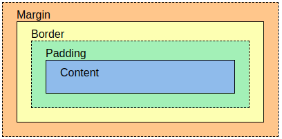
The box model in CSS basically is a box that wraps every HTML element and consists of:
- Content: the content of the box (where text and images appear)
- Padding: clears area around the content (transparent)
- Border: border that wraps the content and padding
- Margin: clears area around the border (transparent)
Please explore margin, border, and padding independently through this reference.
Introduction to Bootstrap & Tailwind
In web development, there are many CSS frameworks that are commonly used. The function of a framework is to facilitate the work of programmers when doing their work. Popular CSS frameworks today are Bootstrap and Tailwind. Both frameworks provide many advantages compared to regular CSS. Here are the advantages of using frameworks compared to regular CSS:
- Faster Development Process: Frameworks like Bootstrap provide ready-to-use components without having to write CSS code from scratch.
- Responsive by Default: Frameworks like Bootstrap and Tailwind are designed to be responsive.
- Easy Customization: Tailwind allows deep customization. Meanwhile, Bootstrap also offers customization options but with a more limited approach.
- Large Scalability: CSS frameworks provide good structure for projects that grow over time.
Bootstrap and Tailwind as frameworks have significant differences between each other:
| Tailwind | Bootstrap |
|---|---|
| Tailwind CSS builds appearance by combining predefined utility classes. | Bootstrap uses predefined styles and components that have ready-made appearance and can be used directly. |
| Tailwind CSS has slightly smaller CSS files compared to Bootstrap and will only load utility classes that exist | Bootstrap has larger CSS files compared to Tailwind CSS because it includes many predefined components. |
| Tailwind CSS provides high flexibility and adaptability to projects | Bootstrap often produces more consistent appearance across projects because it uses predefined components. |
| Tailwind CSS has a steeper learning curve because it requires understanding of available utility classes and how to combine them to achieve the desired appearance. | Bootstrap has faster learning for beginners because they can start with predefined components. |
Responsive Web Design
Responsive web design is a web design system method that aims to produce web displays that look good on all devices such as desktop, tablet, mobile, and so on. Responsive web design does not change the content of the website, but only changes the display and layout on each device to match the screen width and capabilities of that device. In responsive web design, certain displays require CSS help (such as shrinking or enlarging) an element.
One way to test whether a website uses responsive web design is by accessing the website and activating the Toggle Device Mode feature in the browser. This feature allows you to see how the website is displayed on various devices, such as computers, tablets, or smartphones, without having to change the browser window size.
Here's how to access this feature in Google Chrome browser:
- Windows/Linux: Press
CTRL + SHIFT + Ito open Dev Tools, then pressCTRL + SHIFT + Mto activateToggle Device Mode. - Mac:
Command + Shift + M
A more practical way is to right-click in the browser and select Inspect Element/Inspect to open useful Dev Tools.
To learn more about Responsive Web Design, you can open this reference.
Tutorial: Adding Tailwind to Application
In this tutorial, we will focus on using Tailwind to style our Django application.
-
Open your Django project (football-news), then open the
base.htmlfile that was created previously in the templates folder located in the root project. -
Inside
templates/base.html, add the<meta name="viewport">tag so your web page can adjust to mobile device size and behavior (if not already done).<head>
{% block meta %}
<meta charset="UTF-8" />
<meta name="viewport" content="width=device-width, initial-scale=1">
{% endblock meta %}
</head> -
To connect Django template with Tailwind, we can use Tailwind's CDN (Content Delivery Network) script to be placed inside the Django HTML template. In
base.html, you need to add the tailwind CDN script in the head section.<head>
{% block meta %}
<meta charset="UTF-8" />
<meta name="viewport" content="width=device-width, initial-scale=1">
{% endblock meta %}
<script src="https://cdn.tailwindcss.com">
</script>
</head>
Tutorial: Adding Bootstrap to Application (Skip if Choosing Tailwind)
Important: If you choose Bootstrap, you must skip the Tailwind tutorial because CSS class conflicts can occur if combined with Bootstrap.
-
Open your Django project (football-news), then open the
base.htmlfile that was created previously in the templates folder located in the root project. -
Inside
templates/base.html, add the<meta name="viewport">tag so your web page can adjust to mobile device size and behavior (if not already done).<head>
{% block meta %}
<meta charset="UTF-8" />
<meta name="viewport" content="width=device-width, initial-scale=1">
{% endblock meta %}
</head> -
Add Bootstrap CSS and JS.
CSS:
<head>
    {% block meta %}
        ...
    {% endblock meta %}
    <link href="https://cdn.jsdelivr.net/npm/bootstrap@5.3.2/dist/css/bootstrap.min.css" rel="stylesheet" integrity="sha384-T3c6CoIi6uLrA9TneNEoa7RxnatzjcDSCmG1MXxSR1GAsXEV/Dwwykc2MPK8M2HN" crossorigin="anonymous">
</head>
JS:
<head>
    ...
    <script src="https://code.jquery.com/jquery-3.6.0.min.js" integrity="sha384-KyZXEAg3QhqLMpG8r+J4jsl5c9zdLKaUk5Ae5f5b1bw6AUn5f5v8FZJoMxm6f5cH1" crossorigin="anonymous"></script>
</head> -
(Optional) If you want to use dropdowns, popovers, tooltips provided by Bootstrap framework, you need to add these 2 JS script lines below the JS script you created earlier.
<head>
    ...
    <script src="https://cdn.jsdelivr.net/npm/@popperjs/core@2.11.8/dist/umd/popper.min.js" integrity="sha384-I7E8VVD/ismYTF4hNIPjVp/Zjvgyol6VFvRkX/vR+Vc4jQkC+hVqc2pM8ODewa9r" crossorigin="anonymous"></script>
    <script src="https://cdn.jsdelivr.net/npm/bootstrap@5.3.2/dist/js/bootstrap.min.js" integrity="sha384-BBtl+eGJRgqQAUMxJ7pMwbEyER4l1g+O15P+16Ep7Q9Q+zqX6gSbd85u4mG4QzX+" crossorigin="anonymous"></script>
</head>
Reference: Get Started with Bootstrap 5.3
Tutorial: Adding Edit News Feature to Application
Here are the things you need to do to add the feature to modify news data:
-
Open
views.pyin themainsubdirectory, and create a new function namededit_newsthat acceptsrequestandidparameters as follows:def edit_news(request, id):
news = get_object_or_404(News, pk=id)
form = NewsForm(request.POST or None, instance=news)
if form.is_valid() and request.method == 'POST':
form.save()
return redirect('main:show_main')
context = {
'form': form
}
return render(request, "edit_news.html", context) -
Create a new HTML file named
edit_news.htmlin themain/templatessubdirectory. Fill the file with the following template:{% extends 'base.html' %}
{% load static %}
{% block content %}
<h1>Edit News</h1>
<form method="POST">
{% csrf_token %}
<table>
{{ form.as_table }}
<tr>
<td></td>
<td>
<input type="submit" value="Edit News"/>
</td>
</tr>
</table>
</form>
{% endblock %} -
Open
urls.pyin themaindirectory and import theedit_newsfunction that was created:from main.views import edit_news -
Add a url path to
urlpatternsto access the imported function:...
path('news/<uuid:id>/edit', edit_news, name='edit_news'),
... -
Open
main.htmlin themain/templatessubdirectory. In thenews_listloop, update the following code snippet to display an edit button for each news article:...
{% for news in news_list %}
<div>
<h2><a href="{% url 'main:show_news' news.id %}">{{ news.title }}</a></h2>
<p><b>{{ news.get_category_display }}</b>{% if news.is_featured %} |
<b>Featured</b>{% endif %}{% if news.is_news_hot %} |
<b>Hot</b>{% endif %} | <i>{{ news.created_at|date:"d M Y H:i" }}</i>
| Views: {{ news.news_views }}</p>
{% if news.thumbnail %}
<img src="{{ news.thumbnail }}" alt="thumbnail" width="150" height="100">
<br />
{% endif %}
<p>{{ news.content|truncatewords:25 }}...</p>
<p>
<a href="{% url 'main:show_news' news.id %}"><button>Read More</button></a>
{% if user.is_authenticated and news.user == user %}
<a href="{% url 'main:edit_news' news.pk %}">
<button>
Edit
</button>
</a>
{% endif %}
</p>
</div>
<hr>
{% endfor %}
... -
Run your Django project with the command
python manage.py runserverand open http://localhost:8000 in your favorite browser. After login, try clicking theeditbutton on a news item and change its data as you like. If the changes are saved and visible on the main page of the application without errors, congratulations, you have successfully added the edit feature!
Tutorial: Adding Delete News Feature to Application
Here are the things you need to do to add the feature to delete news data:
-
Create a new function named
delete_newsthat acceptsrequestandidparameters inviews.pyin themainfolder to delete news data. You can use the following code:Don't forget to understand the contents of the code 😅
def delete_news(request, id):
    news = get_object_or_404(News, pk=id)
    news.delete()
return HttpResponseRedirect(reverse('main:show_main')) -
Open
urls.pyin themainfolder and import the function you just created:from main.views import delete_news -
Add a url path to
urlpatternsto access the imported function:...
path('news/<uuid:id>/delete', delete_news, name='delete_news'),
... -
Open the
main.htmlfile in themain/templatesfolder and in thenews_listloop, update the following code snippet so there is a delete button for each news article:...
{% for news in news_list %}
<div>
<h2><a href="{% url 'main:show_news' news.id %}">{{ news.title }}</a></h2>
<p><b>{{ news.get_category_display }}</b>{% if news.is_featured %} |
<b>Featured</b>{% endif %}{% if news.is_news_hot %} |
<b>Hot</b>{% endif %} | <i>{{ news.created_at|date:"d M Y H:i" }}</i>
| Views: {{ news.news_views }}</p>
{% if news.thumbnail %}
<img src="{{ news.thumbnail }}" alt="thumbnail" width="150" height="100">
<br />
{% endif %}
<p>{{ news.content|truncatewords:25 }}...</p>
<p>
<a href="{% url 'main:show_news' news.id %}"><button>Read More</button></a>
{% if user.is_authenticated and news.user == user %}
<a href="{% url 'main:edit_news' news.pk %}">
<button>
Edit
</button>
</a>
<a href="{% url 'main:delete_news' news.pk %}">
<button>
Delete
</button>
</a>
{% endif %}
</p>
</div>
<hr>
{% endfor %}
... -
Run your Django project with the command
python manage.py runserverand open http://localhost:8000 in your favorite browser. After login, try deleting some news data and refresh the page. If the news disappears from your application's main page without errors, congratulations, you have successfully added the delete feature!
Tutorial: Adding Navigation Bar to Application
Navigation Bar (navbar) is an element usually used to navigate various pages or features in a web application. Navbar is usually placed at the top of the page and contains links or buttons that lead to other pages in the application.
- Create a new HTML file named
navbar.htmlin thetemplates/folder in the root directory. Fill the contents ofnavbar.htmlwith the following template:<nav>
<h1>Football News</h1>
<ul>
<li><a href="/">Home</a></li>
<li><a href="{% url 'main:create_news' %}">Create News</a></li>
</ul>
{% if user.is_authenticated %}
<div>
<span>Welcome, {{ name|default:user.username }}</span>
<span>{{ npm|default:"Student" }} - {{ class|default:"Class" }}</span>
<a href="{% url 'main:logout' %}">Logout</a>
</div>
{% else %}
<div>
<a href="{% url 'main:login' %}">Login</a>
<a href="{% url 'main:register' %}">Register</a>
</div>
{% endif %}
</nav> - Then, link the navbar to
main.htmlin themain/templates/subdirectory using theincludetags:{% extends 'base.html' %}
{% block content %}
{% include 'navbar.html' %}
...
{% endblock content%}
Note: The ... sign indicates other code in the file that doesn't need to be changed.
Tutorial: Configuring Static Files in Application
- In
settings.py, add WhiteNoise middleware:
...
MIDDLEWARE = [
    'django.middleware.security.SecurityMiddleware',
    'whitenoise.middleware.WhiteNoiseMiddleware', # Add right below SecurityMiddleware
    ...
]
...
By adding WhiteNoise middleware in settings.py, Django can manage static files automatically in production mode (DEBUG=False) without needing complex configuration. This is useful so that static files can be accessed in your deployment because by default, if DEBUG=False then Django will not provide access to static files.
- In
settings.py, make sure theSTATIC_ROOT,STATICFILES_DIRS, andSTATIC_URLvariables are configured like this (if they don't exist yet, you can just add them):
...
STATIC_URL = '/static/'
if DEBUG:
    STATICFILES_DIRS = [
        BASE_DIR / 'static' # refers to /static root project in development mode
    ]
else:
    STATIC_ROOT = BASE_DIR / 'static' # refers to /static root project in production mode
...
Application Styling with Tailwind and External CSS
Adding global.css
Create a global.css file in /static/css in the root directory like this:

In this global.css file, you can add custom classes or CSS styles that you have defined yourself.
Connecting global.css and Tailwind script to base.html
For CSS styles added in global.css to be used in Django templates, you need to add that file to base.html.
Modify your base.html file as follows:
{% load static %}
<!DOCTYPE html>
<html lang="en">
  <head>
    <meta charset="UTF-8" />
    <meta name="viewport" content="width=device-width, initial-scale=1.0" />
    {% block meta %} {% endblock meta %}
    <script src="https://cdn.tailwindcss.com"></script>
    <link rel="stylesheet" href="{% static 'css/global.css' %}"/>
  </head>
  <body>
    {% block content %} {% endblock content %}
  </body>
</html>
Adding custom styling to global.css
Modify the global.css file in static/css/global.css as follows:
.form-style form input, form textarea, form select {
    width: 100%;
    padding: 0.5rem;
    border: 2px solid #bcbcbc;
    border-radius: 0.375rem;
}
.form-style form input:focus, form textarea:focus, form select:focus {
    outline: none;
    border-color: #16a34a;
    box-shadow: 0 0 0 3px #16a34a;
}

.form-style input[type="checkbox"] {
    width: 1.25rem;
    height: 1.25rem;
    padding: 0;
    border: 2px solid #d1d5db;
    border-radius: 0.375rem;
    background-color: white;
    cursor: pointer;
    position: relative;
    appearance: none;
    -webkit-appearance: none;
    -moz-appearance: none;
}

.form-style input[type="checkbox"]:checked {
    background-color: #16a34a;
    border-color: #16a34a;
}

.form-style input[type="checkbox"]:checked::after {
    content: '✓';
    position: absolute;
    top: 50%;
    left: 50%;
    transform: translate(-50%, -50%);
    color: white;
    font-weight: bold;
    font-size: 0.875rem;
}

.form-style input[type="checkbox"]:focus {
    outline: none;
    border-color: #16a34a;
    box-shadow: 0 0 0 3px rgba(22, 163, 74, 0.1);
}
The CSS above is used to set the appearance of forms that have the form-style class. This CSS code will make all inputs have full width, padding, gray border, and rounded corners. When users click or focus on input, the border will change color to green with shadow effect to show that the input is active.
Styling Navbar
After creating a basic navbar, now we will add styling to make the navbar look more attractive and responsive. Update the navbar code in the navbar.html template as follows:
<nav class="fixed top-0 left-0 w-full bg-white border-b border-gray-200 shadow-sm z-50">
    <div class="max-w-7xl mx-auto px-6 lg:px-8">
      <div class="flex items-center justify-between h-16">
        <div class="flex items-center">
          <h1 class="text-xl font-semibold text-gray-900">
            <span class="text-green-600">Football</span> News
          </h1>
        </div>

        <!-- Desktop Navigation -->
        <div class="hidden md:flex items-center space-x-8">
          <a href="/" class="text-gray-600 hover:text-gray-900 font-medium transition-colors">
            Home
          </a>
          <a href="{% url 'main:create_news' %}" class="text-gray-600 hover:text-gray-900 font-medium transition-colors">
            Create News
          </a>
        </div>

        <!-- Desktop User Section -->
        <div class="hidden md:flex items-center space-x-6">
          {% if user.is_authenticated %}
            <div class="text-right">
              <div class="text-sm font-medium text-gray-900">{{ name|default:user.username }}</div>
              <div class="text-xs text-gray-500">{{ npm|default:"Student" }} - {{ class|default:"Class" }}</div>
            </div>
            <a href="{% url 'main:logout' %}" class="text-red-600 hover:text-red-700 font-medium transition-colors">
              Logout
            </a>
          {% else %}
            <a href="{% url 'main:login' %}" class="text-gray-600 hover:text-gray-900 font-medium transition-colors">
              Login
            </a>
            <a href="{% url 'main:register' %}" class="bg-green-600 hover:bg-green-700 text-white px-4 py-2 rounded font-medium transition-colors">
              Register
            </a>
          {% endif %}
        </div>

        <!-- Mobile Menu Button -->
        <div class="md:hidden flex items-center">
          <button class="mobile-menu-button p-2 text-gray-600 hover:text-gray-900 transition-colors">
            <span class="sr-only">Open menu</span>
            <div class="w-6 h-6 flex flex-col justify-center items-center">
              <span class="bg-current block transition-all duration-300 ease-out h-0.5 w-6 rounded-sm"></span>
              <span class="bg-current block transition-all duration-300 ease-out h-0.5 w-6 rounded-sm my-0.5"></span>
              <span class="bg-current block transition-all duration-300 ease-out h-0.5 w-6 rounded-sm"></span>
            </div>
          </button>
        </div>
      </div>
    </div>
    <!-- Mobile Menu -->
    <div class="mobile-menu hidden md:hidden bg-white border-t border-gray-200">
      <div class="px-6 py-4 space-y-4">
        <!-- Mobile Navigation Links -->
        <div class="space-y-1">
          <a href="/" class="block text-gray-600 hover:text-gray-900 font-medium py-3 transition-colors">
            Home
          </a>
          <a href="{% url 'main:create_news' %}" class="block text-gray-600 hover:text-gray-900 font-medium py-3 transition-colors">
            Create News
          </a>
        </div>

        <!-- Mobile User Section -->
        <div class="border-t border-gray-200 pt-4">
          {% if user.is_authenticated %}
            <div class="mb-4">
              <div class="font-medium text-gray-900">{{ name|default:user.username }}</div>
              <div class="text-sm text-gray-500">{{ npm|default:"Student" }} - {{ class|default:"Class" }}</div>
            </div>
            <a href="{% url 'main:logout' %}" class="block text-red-600 hover:text-red-700 font-medium py-3 transition-colors">
              Logout
            </a>
          {% else %}
            <div class="space-y-3">
              <a href="{% url 'main:login' %}" class="block text-gray-600 hover:text-gray-900 font-medium py-3 transition-colors">
                Login
              </a>
              <a href="{% url 'main:register' %}" class="block bg-green-600 hover:bg-green-700 text-white font-medium py-3 px-4 rounded text-center transition-colors">
                Register
              </a>
            </div>
          {% endif %}
        </div>
      </div>
    </div>
    <script>
      const btn = document.querySelector("button.mobile-menu-button");
      const menu = document.querySelector(".mobile-menu");

      btn.addEventListener("click", () => {
        menu.classList.toggle("hidden");
      });
    </script>
  </nav>
The navbar above uses Tailwind CSS with fixed position at the top of the page. The navbar structure consists of title on the left, navigation menu in the center, and user section on the right. On mobile display, the navigation menu is hidden and replaced with a hamburger button. JavaScript is used to show/hide the mobile menu when the button is clicked.
Note: For this tutorial, you don't need to understand how <script> works. The use of <script> will be learned in tutorial 5 next week.
Here are some additional references on how to create navigation bars that you can use:
- Using Tailwind: accessible through this link
- Using Bootstrap: accessible through this link
- Using manual CSS: accessible through this link
Styling Login Page
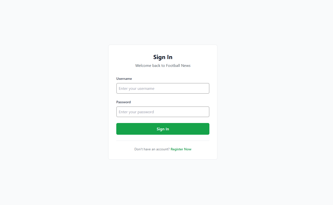
Change the login.html file in the main/templates/ subdirectory to the following:
{% extends 'base.html' %}

{% block meta %}
<title>Login - Football News</title>
{% endblock meta %}

{% block content %}
<div class="bg-gray-50 w-full min-h-screen flex items-center justify-center p-8">
  <div class="max-w-md w-full">
    <div class="bg-white rounded-lg border border-gray-200 p-6 sm:p-8 form-style">
      <div class="text-center mb-8">
        <h1 class="text-2xl font-bold text-gray-900 mb-2">Sign In</h1>
        <p class="text-gray-600">Welcome back to Football News</p>
      </div>

      <!-- Form Errors Display -->
      {% if form.non_field_errors %}
        <div class="mb-6">
          {% for error in form.non_field_errors %}
            <div class="px-4 py-3 rounded-md text-sm border bg-red-50 border-red-200 text-red-700">
              {{ error }}
            </div>
          {% endfor %}
        </div>
      {% endif %}

      {% if form.errors %}
        <div class="mb-6">
          {% for field, errors in form.errors.items %}
            {% if field != '__all__' %}
              {% for error in errors %}
                <div class="px-4 py-3 rounded-md text-sm border bg-red-50 border-red-200 text-red-700 mb-2">
                  <strong>{{ field|title }}:</strong> {{ error }}
                </div>
              {% endfor %}
            {% endif %}
          {% endfor %}
        </div>
      {% endif %}

      <form method="POST" action="" class="space-y-6">
        {% csrf_token %}

        <div>
          <label for="username" class="block text-sm font-medium text-gray-700 mb-2">Username</label>
          <input
            id="username"
            name="username"
            type="text"
            required
            class="w-full px-4 py-3 border border-gray-300 rounded-md focus:outline-none focus:border-green-500 transition-colors"
            placeholder="Enter your username">
        </div>

        <div>
          <label for="password" class="block text-sm font-medium text-gray-700 mb-2">Password</label>
          <input
            id="password"
            name="password"
            type="password"
            required
            class="w-full px-4 py-3 border border-gray-300 rounded-md focus:outline-none focus:border-green-500 transition-colors"
            placeholder="Enter your password">
        </div>

        <button
          type="submit"
          class="w-full bg-green-600 text-white font-medium py-3 px-4 rounded-md hover:bg-green-700 transition-colors">
          Sign In
        </button>
      </form>

      <!-- Messages Display -->
      {% if messages %}
        <div class="mt-6">
          {% for message in messages %}
            <div
              class="
                px-4 py-3 rounded-md text-sm border
                {% if message.tags == 'success' %}
                  bg-green-50 border-green-200 text-green-700
                {% elif message.tags == 'error' %}
                  bg-red-50 border-red-200 text-red-700
                {% else %}
                  bg-gray-50 border-gray-200 text-gray-700
                {% endif %}
              ">
              {{ message }}
            </div>
          {% endfor %}
        </div>
      {% endif %}

      <div class="mt-6 text-center pt-6 border-t border-gray-200">
        <p class="text-gray-500 text-sm">
          Don't have an account?
          <a href="{% url 'main:register' %}" class="text-green-600 hover:text-green-700 font-medium">
            Register Now
          </a>
        </p>
      </div>
    </div>
  </div>
</div>
{% endblock content %}
Styling Register Page
Change the register.html file in the main/templates/ subdirectory to the following:
{% extends 'base.html' %}

{% block meta %}
<title>Register - Football News</title>
{% endblock meta %}

{% block content %}
<div class="form-style">
  <div class="min-h-screen bg-gray-50 flex items-center justify-center p-8">
    <div class="max-w-md w-full relative z-10">
      <div class="bg-white border border-gray-200 rounded-lg p-8 shadow-sm">
      <div class="text-center mb-8">
        <h2 class="text-2xl font-semibold text-gray-900 mb-2">Join Us</h2>
        <p class="text-gray-500">Create your Football News account</p>
      </div>

      <!-- Form Errors Display -->
      {% if form.non_field_errors %}
        <div class="mb-6">
          {% for error in form.non_field_errors %}
            <div class="px-4 py-3 rounded text-sm border bg-red-50 border-red-200 text-red-700">
              {{ error }}
            </div>
          {% endfor %}
        </div>
      {% endif %}

      {% if form.errors %}
        <div class="mb-6">
          {% for field, errors in form.errors.items %}
            {% if field != '__all__' %}
              {% for error in errors %}
                <div class="px-4 py-3 rounded text-sm border bg-red-50 border-red-200 text-red-700 mb-2">
                  <strong>{{ field|title }}:</strong> {{ error }}
                </div>
              {% endfor %}
            {% endif %}
          {% endfor %}
        </div>
      {% endif %}

      <form method="POST" action="" class="space-y-5">
        {% csrf_token %}

        <div>
          <label for="username" class="block text-sm font-medium text-gray-700 mb-2">Username</label>
          <input
            id="username"
            name="username"
            type="text"
            required
            class="w-full px-4 py-3 border border-gray-300 rounded focus:outline-none focus:border-green-500 transition duration-200"
            placeholder="Choose a username">
        </div>

        <div>
          <label for="password1" class="block text-sm font-medium text-gray-700 mb-2">Password</label>
          <input
            id="password1"
            name="password1"
            type="password"
            required
            class="w-full px-4 py-3 border border-gray-300 rounded focus:outline-none focus:border-green-500 transition duration-200"
            placeholder="Create a password">
        </div>

        <div>
          <label for="password2" class="block text-sm font-medium text-gray-700 mb-2">Confirm Password</label>
          <input
            id="password2"
            name="password2"
            type="password"
            required
            class="w-full px-4 py-3 border border-gray-300 rounded focus:outline-none focus:border-green-500 transition duration-200"
            placeholder="Confirm your password">
        </div>

        <button
          type="submit"
          class="w-full bg-green-600 text-white font-medium py-3 px-4 rounded hover:bg-green-700 focus:outline-none focus:ring-2 focus:ring-green-500 focus:ring-offset-2 transition duration-200">
          Create Account
        </button>
      </form>

      <!-- Messages Display -->
      {% if messages %}
        <div class="mt-6">
          {% for message in messages %}
            <div
              class="
                px-4 py-3 rounded text-sm border
                {% if message.tags == 'success' %}
                  bg-green-50 border-green-200 text-green-700
                {% elif message.tags == 'error' %}
                  bg-red-50 border-red-200 text-red-700
                {% else %}
                  bg-gray-50 border-gray-200 text-gray-700
                {% endif %}
              ">
              {{ message }}
            </div>
          {% endfor %}
        </div>
      {% endif %}

      <div class="mt-6 text-center">
        <p class="text-gray-500 text-sm">
          Already have an account?
          <a href="{% url 'main:login' %}" class="text-green-600 hover:text-green-700 font-medium">
            Sign In
          </a>
        </p>
      </div>
      </div>
    </div>
  </div>
</div>
{% endblock content %}
Styling Home Page
-
Create a
card_news.htmlfile in themain/templatesdirectory, then add the following HTML code:{% load static %}
<article class="bg-white rounded-lg border border-gray-200 hover:shadow-lg transition-shadow duration-300 overflow-hidden">
<!-- Thumbnail -->
<div class="aspect-[16/9] relative overflow-hidden">
{% if news.thumbnail %}
<img src="{{ news.thumbnail }}" alt="{{ news.title }}" class="w-full h-full object-cover">
{% else %}
<div class="w-full h-full bg-gray-200"></div>
{% endif %}
<!-- Category Badge -->
<div class="absolute top-3 left-3">
<span class="inline-flex items-center px-2.5 py-0.5 rounded-md text-xs font-medium bg-green-600 text-white">
{{ news.get_category_display }}
</span>
</div>
<!-- Status Badges -->
<div class="absolute top-3 right-3 flex space-x-2">
{% if news.is_featured %}
<span class="inline-flex items-center px-2 py-1 rounded text-xs font-medium bg-yellow-100 text-yellow-800">
Featured
</span>
{% endif %}
{% if news.is_news_hot %}
<span class="inline-flex items-center px-2 py-1 rounded text-xs font-medium bg-red-100 text-red-800">
Hot
</span>
{% endif %}
</div>
</div>
<!-- Content -->
<div class="p-5">
<div class="flex items-center text-sm text-gray-500 mb-3">
<time datetime="{{ news.created_at|date:'c' }}">
{{ news.created_at|date:"M j, Y" }}
</time>
<span class="mx-2">•</span>
<span>{{ news.news_views }} views</span>
</div>
<h3 class="text-lg font-semibold text-gray-900 mb-3 line-clamp-2 leading-tight">
<a href="{% url 'main:show_news' news.id %}" class="hover:text-green-600 transition-colors">
{{ news.title }}
</a>
</h3>
<p class="text-gray-600 text-sm leading-relaxed line-clamp-3 mb-4">
{{ news.content|truncatewords:20 }}
</p>
<!-- Action Buttons -->
{% if user.is_authenticated and news.user == user %}
<div class="flex items-center justify-between pt-4 border-t border-gray-100">
<a href="{% url 'main:show_news' news.id %}" class="text-green-600 hover:text-green-700 font-medium text-sm transition-colors">
Read more
</a>
<div class="flex space-x-2">
<a href="{% url 'main:edit_news' news.id %}" class="text-gray-600 hover:text-gray-700 text-sm transition-colors">
Edit
</a>
<a href="{% url 'main:delete_news' news.id %}" class="text-red-600 hover:text-red-700 text-sm transition-colors">
Delete
</a>
</div>
</div>
{% else %}
<div class="pt-4 border-t border-gray-100">
<a href="{% url 'main:show_news' news.id %}" class="text-green-600 hover:text-green-700 font-medium text-sm transition-colors">
Read more →
</a>
</div>
{% endif %}
</div>
</article>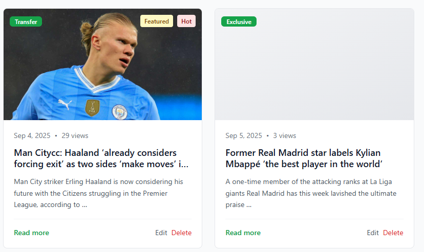
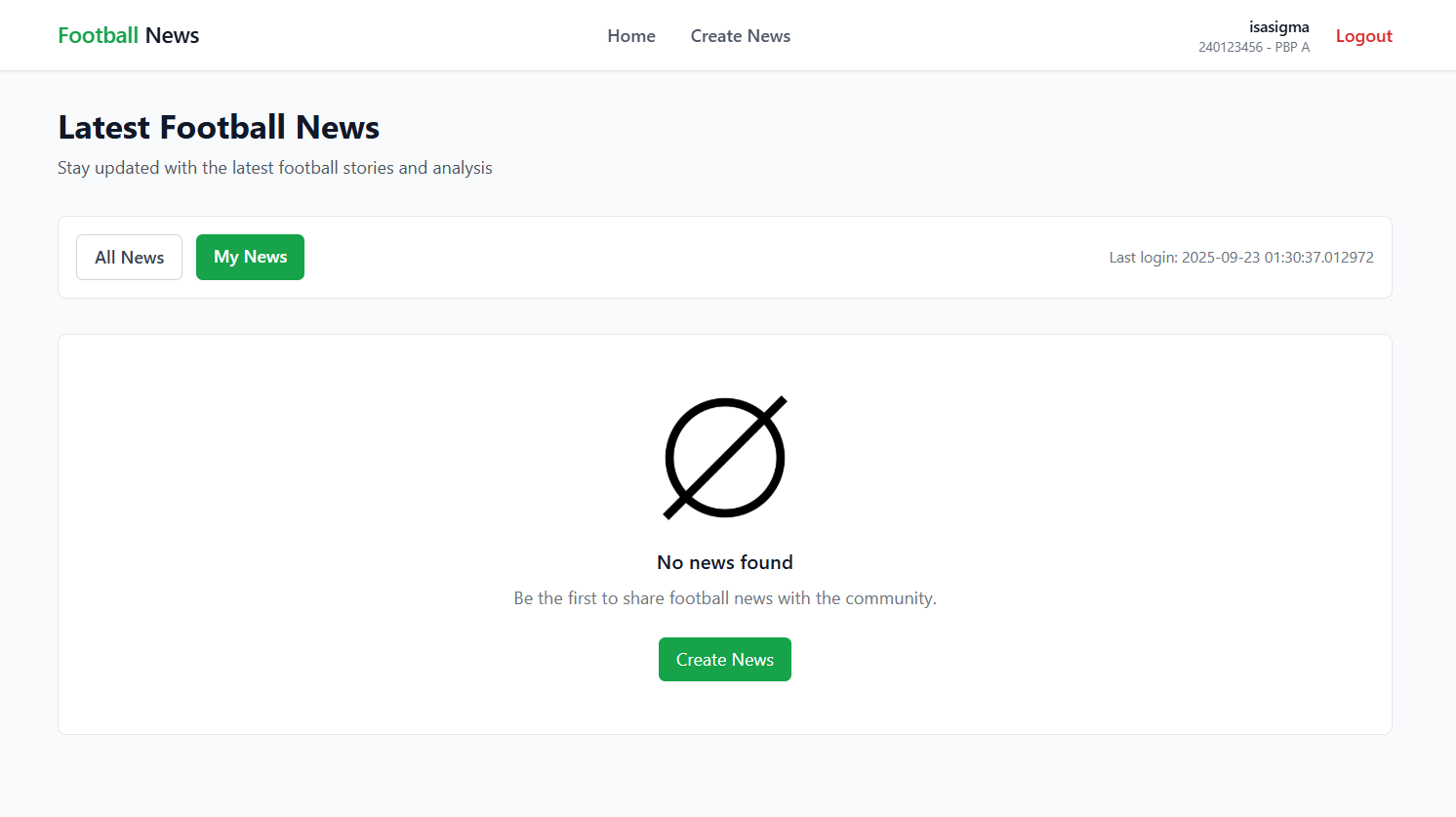
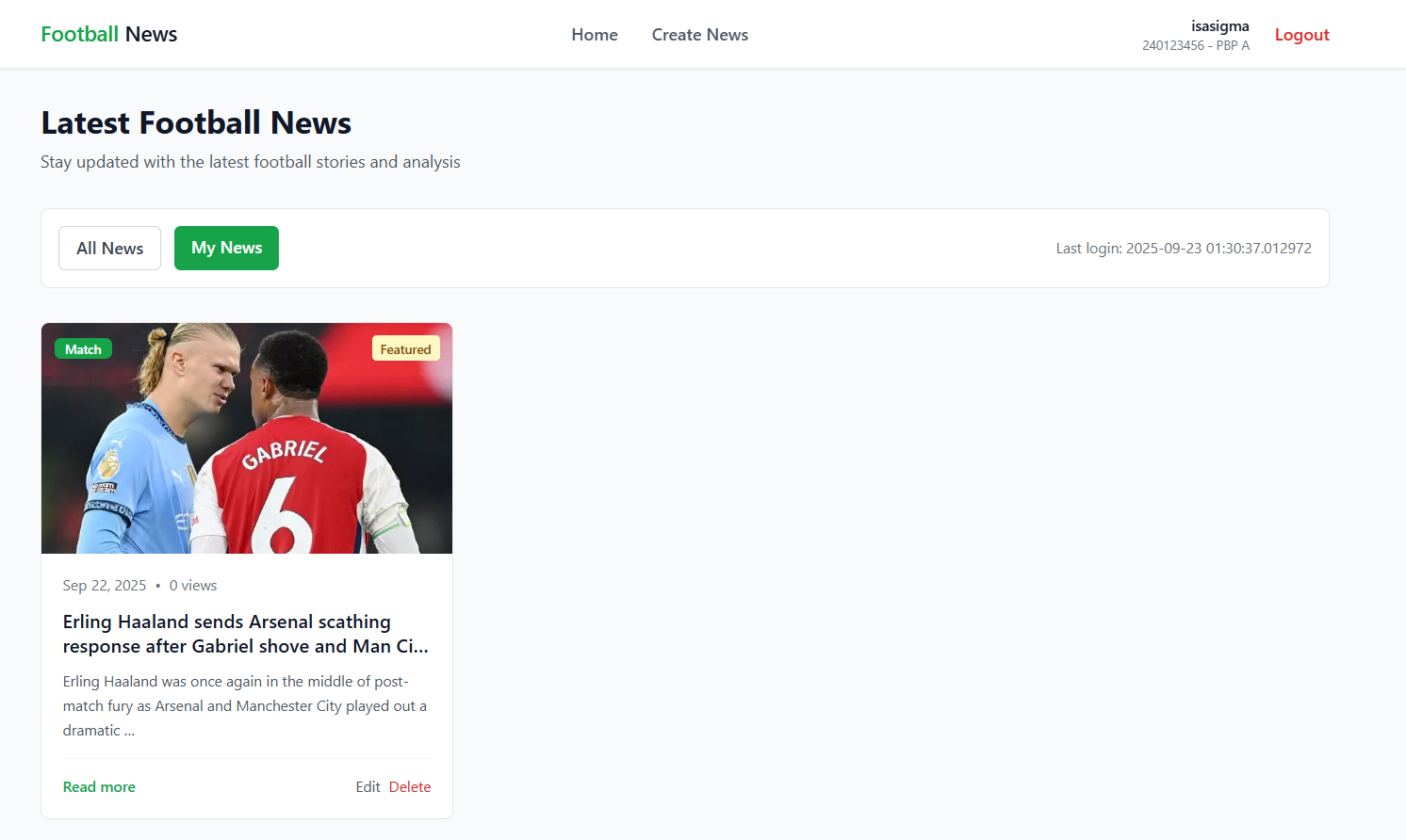
Note: This is an example view of the card_news.html element
-
Next, we need a display when news is still empty. Choose a photo or empty icon and name it
no-news.png. You are free to choose any photo. Add theno-news.pngphoto to thestatic/imagedirectory in the root project. -
After everything is complete, we need to use
card_news.htmlandno-news.pngin themain.htmltemplate. In themain/templatesdirectory, modifymain.htmllike this:
{% extends 'base.html' %}
    {% load static %}

    {% block meta %}
    <title>Football News</title>
    {% endblock meta %}

    {% block content %}
    {% include 'navbar.html' %}
    <div class="bg-gray-50 w-full pt-16 min-h-screen">
      <div class="max-w-7xl mx-auto px-4 sm:px-6 lg:px-8 py-8">

        <!-- Header Section -->
        <div class="mb-8">
          <h1 class="text-3xl font-bold text-gray-900 mb-2">Latest Football News</h1>
          <p class="text-gray-600">Stay updated with the latest football stories and analysis</p>
        </div>

        <!-- Filter Section -->
        <div class="flex flex-col sm:flex-row sm:items-center sm:justify-between mb-8 bg-white rounded-lg border border-gray-200 p-4">
          <div class="flex space-x-3 mb-4 sm:mb-0">
            <a href="?" class="{% if request.GET.filter == 'all' or not request.GET.filter  %} bg-green-600 text-white{% else %}bg-white text-gray-700 border border-gray-300{% endif %} px-4 py-2 rounded-md font-medium transition-colors hover:bg-green-600 hover:text-white">
              All News
            </a>
            <a href="?filter=my" class="{% if request.GET.filter == 'my' %} bg-green-600 text-white{% else %}bg-white text-gray-700 border border-gray-300{% endif %} px-4 py-2 rounded-md font-medium transition-colors hover:bg-green-600 hover:text-white">
              My News
            </a>
          </div>
          {% if user.is_authenticated %}
            <div class="text-sm text-gray-500">
              Last login: {{ last_login }}
            </div>
          {% endif %}
        </div>

        <!-- News Grid -->
        {% if not news_list %}
          <div class="bg-white rounded-lg border border-gray-200 p-12 text-center">
            <div class="w-32 h-32 mx-auto mb-4">
              <img src="{% static 'image/no-news.png' %}" alt="No news available" class="w-full h-full object-contain">
            </div>
            <h3 class="text-lg font-medium text-gray-900 mb-2">No news found</h3>
            <p class="text-gray-500 mb-6">Be the first to share football news with the community.</p>
            <a href="{% url 'main:create_news' %}" class="inline-flex items-center px-4 py-2 bg-green-600 text-white rounded-md hover:bg-green-700 transition-colors">
              Create News
            </a>
          </div>
        {% else %}
          <div class="grid grid-cols-1 md:grid-cols-2 lg:grid-cols-3 gap-6">
            {% for news in news_list %}
              {% include 'card_news.html' with news=news %}
            {% endfor %}
          </div>
        {% endif %}
      </div>
    </div>
    {% endblock content %}
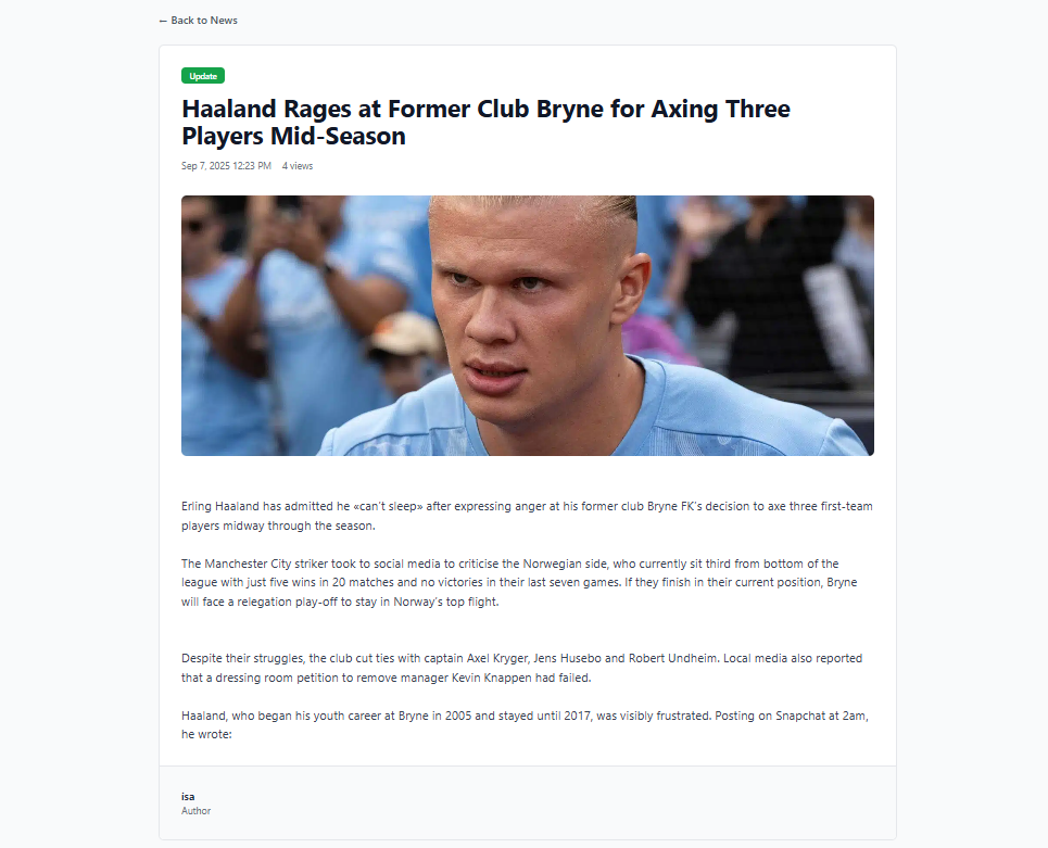
Styling News Detail Page
Change the news_detail.html file in the main/templates subdirectory to the following:
{% extends 'base.html' %}
{% load static %}

{% block meta %}
<title>{{ news.title }} - Football News</title>
{% endblock meta %}

{% block content %}
<div class="bg-gray-50 w-full min-h-screen">
    <div class="max-w-6xl mx-auto px-4 sm:px-6 lg:px-8 py-8">

        <!-- Back Navigation -->
        <div class="mb-6">
            <a href="{% url 'main:show_main' %}" class="text-gray-600 hover:text-gray-900 font-medium transition-colors">
                ← Back to News
            </a>
        </div>

        <!-- Article -->
        <article class="bg-white rounded-lg border border-gray-200 overflow-hidden">

            <!-- Header -->
            <div class="p-6 sm:p-8">
                <div class="flex flex-wrap items-center gap-2 mb-4">
                    <span class="inline-flex items-center px-3 py-1 rounded-md text-xs font-medium bg-green-600 text-white">
                        {{ news.get_category_display }}
                    </span>
                    {% if news.is_featured %}
                        <span class="inline-flex items-center px-3 py-1 rounded-md text-xs font-medium bg-yellow-100 text-yellow-800">
                            Featured
                        </span>
                    {% endif %}
                    {% if news.is_news_hot %}
                        <span class="inline-flex items-center px-3 py-1 rounded-md text-xs font-medium bg-red-100 text-red-800">
                            Hot
                        </span>
                    {% endif %}
                </div>

                <h1 class="text-3xl sm:text-4xl font-bold text-gray-900 leading-tight mb-4">
                    {{ news.title }}
                </h1>

                <div class="flex flex-wrap items-center text-sm text-gray-500 gap-4">
                    <time datetime="{{ news.created_at|date:'c' }}">
                        {{ news.created_at|date:"M j, Y g:i A" }}
                    </time>
                    <span>{{ news.news_views }} views</span>
                </div>
            </div>

            <!-- Featured Image -->
            {% if news.thumbnail %}
                <div class="px-6 sm:px-8">
                    <img src="{{ news.thumbnail }}"
                         alt="{{ news.title }}"
                         class="w-full h-64 sm:h-80 lg:h-96 object-cover rounded-lg">
                </div>
            {% endif %}

            <!-- Content -->
            <div class="p-6 sm:p-8">
                <div class="prose prose-lg max-w-none">
                    <div class="text-gray-700 leading-relaxed whitespace-pre-line text-base sm:text-lg">
                        {{ news.content }}
                    </div>
                </div>
            </div>

            <!-- Author Info -->
            <div class="border-t border-gray-200 p-6 sm:p-8 bg-gray-50">
                <div class="flex items-center justify-between">
                    <div>
                        <div class="font-medium text-gray-900">
                            {% if news.user %}
                                <p>Author: {{ news.user.username }}</p>
                            {% else %}
                                <p>Author: Anonymous</p>
                            {% endif %}
                        </div>
                        <p class="text-sm text-gray-500">Author</p>
                    </div>
                </div>
            </div>
        </article>
    </div>
</div>
{% endblock content %}
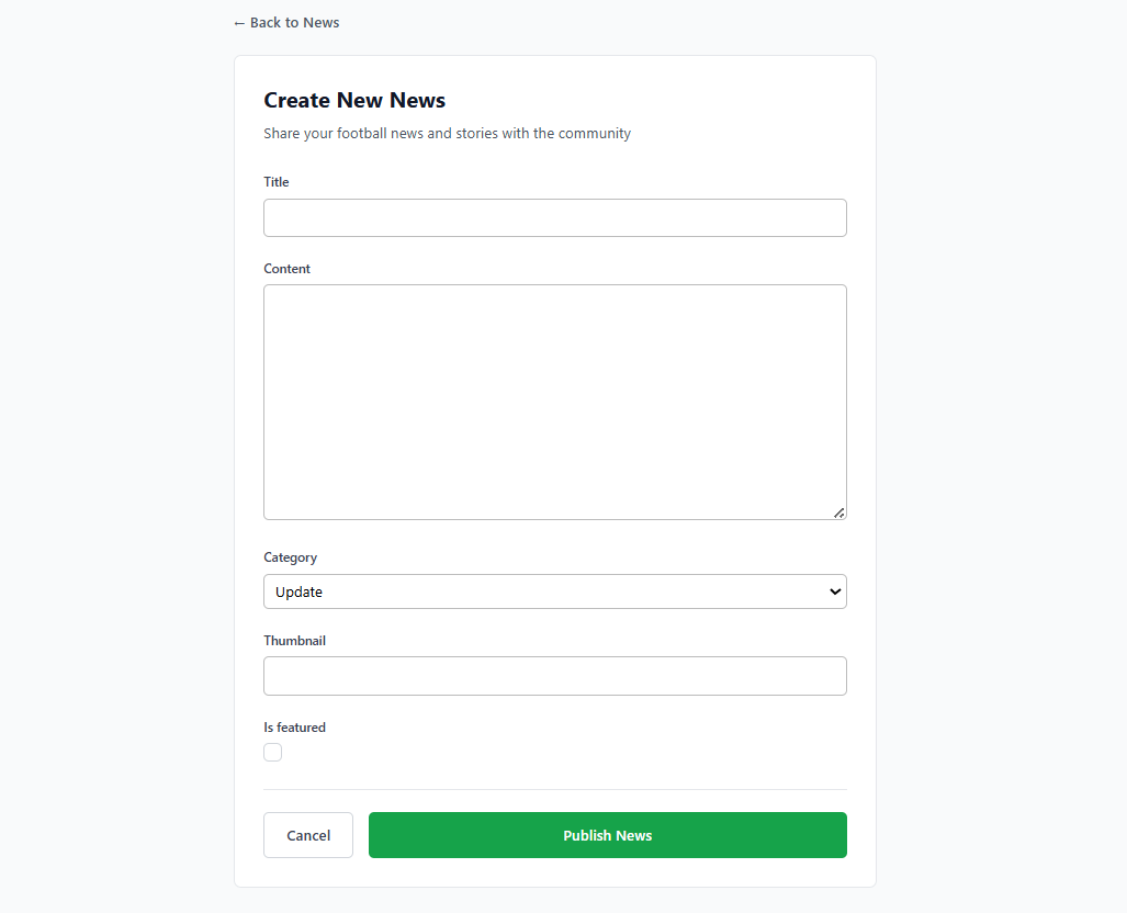
Styling Create News Page
Change the create_news.html file in the main/templates subdirectory to the following:
{% extends 'base.html' %}
{% block meta %}
<title>Create News - Football News</title>
{% endblock meta %}

{% block content %}
<div class="bg-gray-50 w-full min-h-screen">
  <div class="max-w-3xl mx-auto px-4 sm:px-6 lg:px-8 py-8">

    <!-- Back Navigation -->
    <div class="mb-6">
      <a href="{% url 'main:show_main' %}" class="text-gray-600 hover:text-gray-900 font-medium transition-colors">
        ← Back to News
      </a>
    </div>

    <!-- Form -->
    <div class="bg-white rounded-lg border border-gray-200 p-6 sm:p-8 form-style">
      <div class="mb-8">
        <h1 class="text-2xl font-bold text-gray-900 mb-2">Create New News</h1>
        <p class="text-gray-600">Share your football news and stories with the community</p>
      </div>

      <form method="POST" class="space-y-6">
        {% csrf_token %}
        {% for field in form %}
          <div>
            <label for="{{ field.id_for_label }}" class="block text-sm font-medium text-gray-700 mb-2">
              {{ field.label }}
            </label>
            <div class="w-full">
              {{ field }}
            </div>
            {% if field.help_text %}
              <p class="mt-1 text-sm text-gray-500">{{ field.help_text }}</p>
            {% endif %}
            {% for error in field.errors %}
              <p class="mt-1 text-sm text-red-600">{{ error }}</p>
            {% endfor %}
          </div>
        {% endfor %}

        <div class="flex flex-col sm:flex-row gap-4 pt-6 border-t border-gray-200">
          <a href="{% url 'main:show_main' %}" class="order-2 sm:order-1 px-6 py-3 border border-gray-300 text-gray-700 rounded-md font-medium hover:bg-gray-50 transition-colors text-center">
            Cancel
          </a>
          <button type="submit" class="order-1 sm:order-2 flex-1 bg-green-600 text-white px-6 py-3 rounded-md font-medium hover:bg-green-700 transition-colors">
            Publish News
          </button>
        </div>
      </form>
    </div>
  </div>
</div>
{% endblock %}
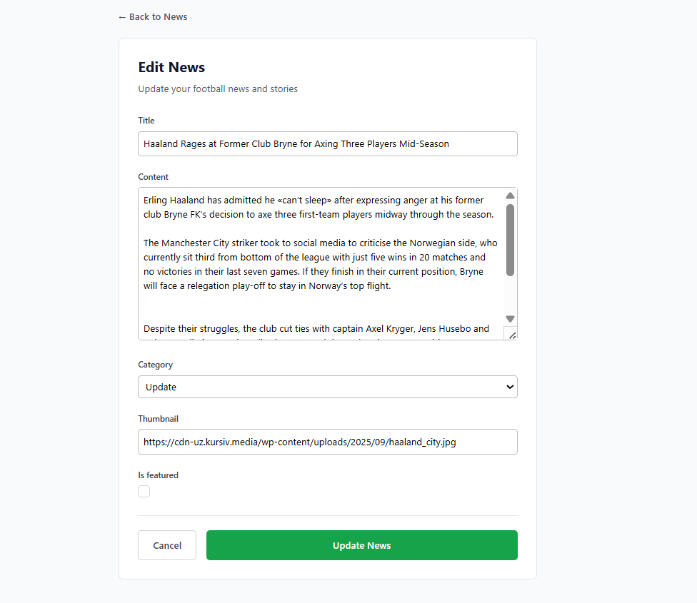
Styling Edit News Page
Change the edit_news.html file in the main/templates subdirectory to the following:
{% extends 'base.html' %}
{% load static %}

{% block meta %}
<title>Edit News - Football News</title>
{% endblock meta %}

{% block content %}
<div class="bg-gray-50 w-full min-h-screen">
  <div class="max-w-3xl mx-auto px-4 sm:px-6 lg:px-8 py-8">

    <!-- Back Navigation -->
    <div class="mb-6">
      <a href="{% url 'main:show_main' %}" class="text-gray-600 hover:text-gray-900 font-medium transition-colors">
        ← Back to News
      </a>
    </div>

    <!-- Form -->
    <div class="bg-white rounded-lg border border-gray-200 p-6 sm:p-8 form-style">
      <div class="mb-8">
        <h1 class="text-2xl font-bold text-gray-900 mb-2">Edit News</h1>
        <p class="text-gray-600">Update your football news and stories</p>
      </div>

      <form method="POST" class="space-y-6">
        {% csrf_token %}
        {% for field in form %}
          <div>
            <label for="{{ field.id_for_label }}" class="block text-sm font-medium text-gray-700 mb-2">
              {{ field.label }}
            </label>
            <div class="w-full">
              {{ field }}
            </div>
            {% if field.help_text %}
              <p class="mt-1 text-sm text-gray-500">{{ field.help_text }}</p>
            {% endif %}
            {% for error in field.errors %}
              <p class="mt-1 text-sm text-red-600">{{ error }}</p>
            {% endfor %}
          </div>
        {% endfor %}

        <div class="flex flex-col sm:flex-row gap-4 pt-6 border-t border-gray-200">
          <a href="{% url 'main:show_main' %}" class="order-2 sm:order-1 px-6 py-3 border border-gray-300 text-gray-700 rounded-md font-medium hover:bg-gray-50 transition-colors text-center">
            Cancel
          </a>
          <button type="submit" class="order-1 sm:order-2 flex-1 bg-green-600 text-white px-6 py-3 rounded-md font-medium hover:bg-green-700 transition-colors">
            Update News
          </button>
        </div>
      </form>
    </div>
  </div>
</div>
{% endblock %}
Conclusion
-
After running the tutorial above, you should have a local directory structure like the following:
football-news
├── env
├── football_news
│   ├── __init__.py
│   ├── asgi.py
│   ├── settings.py
│   ├── urls.py
│   └── wsgi.py
├── main
│   ├── migrations
│   │   ├── __init__.py
│   │   ├── 0001_initial.py
│   │   └── 0002_news_user.py
│   ├── templates
│   │   ├── card_news.html
│   │   ├── create_news.html
│   │   ├── edit_news.html
│   │   ├── login.html
│   │   ├── main.html
│   │   ├── news_detail.html
│   │   └── register.html
│   ├── __init__.py
│   ├── admin.py
│   ├── apps.py
│   ├── forms.py
│   ├── models.py
│   ├── tests.py
│   ├── urls.py
│   └── views.py
├── static
│   └── css
│       └── global.css
│   └── image
│       └── no-news.png
│       └── placeholder.png
├── templates
│   └── base.html
│   └── navbar.html
├── .gitignore
├── manage.py
└── requirements.txt
Contributors
- Isa Citra Buana (ISA)
- Yudayana Arif Prasojo (YAP)
- Siti Shofi Nadhifa (SHF)
- Abhiseka Susanto (BHI)
- Regina Meilani Aruan (GIN)
Credits
This tutorial was developed based on PBP Odd Semester 2025 and PBP Odd Semester 2024 written by the Teaching Team and Teaching Assistants of Platform-Based Programming 2025 and 2024. All tutorials and instructions listed in this repository are designed in such a way that students taking the Platform-Based Programming course can complete the tutorial during lab sessions.