Tutorial 7: Flutter Navigation, Layouts, Forms, and Input Elements
Platform-Based Programming (CSGE602022) — Organized by the Faculty of Computer Science Universitas Indonesia, Odd Semester 2025/202626
Learning Objectives
After completing this tutorial, students are expected to be able to:
- Understand basic navigation and routing in Flutter.
- Understand input elements and forms in Flutter.
- Understand the flow of form creation and data handling in Flutter.
- Understand and apply a simple clean architecture.
Page Navigation in Flutter
When learning web development, you may already know that in a website we can move between pages according to the URL being accessed. The same applies to app development, where we can also navigate from one “page” to another. The difference is that in an application, we don’t navigate using different URLs.
Flutter provides a complete navigation system to move between pages. One of the ways to perform page navigation is by using the Navigator widget. The Navigator widget displays pages on the screen as if they are stacked on top of one another (a stack). To navigate to a new page, we can access the Navigator through the BuildContext and call functions such as push(), pop(), and pushReplacement().
Note: In Flutter, screens and pages are commonly referred to as routes.
Below is an explanation of several commonly used Navigator functions in Flutter application development.
Push (push())
...
    if (item.name == "Add Product") {
        Navigator.push(context,
            MaterialPageRoute(builder: (context) => const NewsFormPage()));
    }
...
The push() method adds a route to the route stack managed by Navigator. This method places the new route at the top of the stack, so the newly added route will appear and be displayed to the user.
Pop (pop())
...
    onPressed: () {
        Navigator.pop(context);
    },
...
The pop() method removes the route currently displayed to the user (the topmost route in the stack) from the route stack managed by the Navigator. This causes the app to move from the current displayed route back to the route underneath it in the stack.
Push Replacement (pushReplacement())
...
    onTap: () {
        Navigator.pushReplacement(
        context,
        MaterialPageRoute(
            builder: (context) => MyHomePage(),
        ));
    },
...
The pushReplacement() method removes the route currently shown to the user and replaces it with a new route. This causes the app to switch from the current route to the provided one. In the stack of routes managed by Navigator, the old route at the top is directly replaced by the new one without altering the routes below it in the stack.
Although push() and pushReplacement() may seem similar, the difference lies in what they do to the top route in the stack. push() will add the new route on top of the existing one, while pushReplacement() replaces the top route with the new one. It is also important to pay attention to the order and contents of the stack — if the stack is empty and the Back button is pressed, the system will exit the application.
Besides the three Navigator methods above, there are also other useful routing methods such as popUntil(), canPop(), and maybePop(). Feel free to explore these methods on your own. To learn more about the Navigator, you can refer to the official documentation: https://api.flutter.dev/flutter/widgets/Navigator-class.html
NOTES: Before starting this tutorial, please note that any //TODO sections in the following code snippets are parts that you will need to fill in yourself later.
Don't forget to complete all remaining TODOs before submitting the tutorial (the submitted tutorial must not contain any TODOs)!
Input and Forms in Flutter
Just like on the web, an application can interact with users through input and forms. Flutter provides a Form widget that can serve as a container for multiple input field widgets. Similar to input fields on the web, Flutter also has various types of input fields, one of which is the TextField widget.
To try a sample of the Form widget, run the following command:
flutter create --sample=widgets.Form.1 form_sample
To learn more about the Form widget, you can refer to the following documentation: Flutter Form Class.
Tutorial: Adding a Drawer Menu for Navigation
To make navigation easier in our Flutter application, we can add a drawer menu. A drawer menu is a panel that slides from the left or right side of the screen, typically containing navigation links to different pages in the app.
-
Open the project you created in Tutorial 6 using your preferred IDE.
-
Create a new file inside a new
widgetsdirectory namedleft_drawer.dart. Add the following code intoleft_drawer.dart.import 'package:flutter/material.dart';
class LeftDrawer extends StatelessWidget {
const LeftDrawer({super.key});
Widget build(BuildContext context) {
return Drawer(
child: ListView(
children: [
const DrawerHeader(
// TODO: Drawer header section
),
// TODO: Routing section
],
),
);
}
} -
Next, add imports for the pages you want to include in the drawer menu. In this example, we will add navigation to
MyHomePageandNewsFormPage.import 'package:flutter/material.dart';
import 'package:football_news/menu.dart';
// TODO: Import the NewsFormPage if already created -
After importing, insert the routing code into the
TODO: Routing section....
ListTile(
leading: const Icon(Icons.home_outlined),
title: const Text('Home'),
// Redirect to MyHomePage
onTap: () {
Navigator.pushReplacement(
context,
MaterialPageRoute(
builder: (context) => MyHomePage(),
));
},
),
ListTile(
leading: const Icon(Icons.post_add),
title: const Text('Add News'),
// Redirect to NewsFormPage
onTap: () {
/*
TODO: Add routing to NewsFormPage here
once the page is created.
*/
},
)
... -
Then, style the drawer by adding a drawer header inside
TODO: Drawer header section....
const DrawerHeader(
decoration: BoxDecoration(
color: Colors.blue,
),
child: Column(
children: [
Text(
'Football News',
textAlign: TextAlign.center,
style: TextStyle(
fontSize: 30,
fontWeight: FontWeight.bold,
color: Colors.white,
),
),
Padding(padding: EdgeInsets.all(10)),
Text(
"All the latest football updates here!",
// TODO: Add text style with center alignment, font size 15, white color, and normal weight
),
],
),
),
... -
Great! Now add the drawer to the page where you want it to appear. Below is an example for
menu.dart....
// Import drawer widget
import 'package:football_news/widgets/left_drawer.dart';
...
return Scaffold(
appBar: AppBar(
// Application title "Football News" in bold white text
title: const Text(
'Football News',
style: TextStyle(
color: Colors.white,
fontWeight: FontWeight.bold,
),
),
backgroundColor: Theme.of(context).colorScheme.primary,
),
drawer: LeftDrawer(),
... -
Congratulations! Your drawer and navigation are now ready. Run the app to see the result.
Don’t forget to complete all remaining TODOs before submitting the tutorial (the submitted tutorial must not contain any TODOs). Also, make sure to add the drawer to the NewsFormPage once that page has been created.
Tutorial: Adding a Form and Input Elements
Now, we will create a simple form to input news data into the application so that later you can add new items to be displayed.
-
Create a new file in the
libdirectory namednewslist_form.dart. Add the following code insidenewslist_form.dart.import 'package:flutter/material.dart';
// TODO: Import the drawer you created earlier
class NewsFormPage extends StatefulWidget {
const NewsFormPage({super.key});
State<NewsFormPage> createState() => _NewsFormPageState();
}
class _NewsFormPageState extends State<NewsFormPage> {
Widget build(BuildContext context) {
return Placeholder();
}
} -
Replace the
Placeholderwidget with the code below.Scaffold(
appBar: AppBar(
title: const Center(
child: Text(
'Add News Form',
),
),
backgroundColor: Colors.indigo,
foregroundColor: Colors.white,
),
// TODO: Add the drawer here
body: Form(
child: SingleChildScrollView(),
),
);Explanation:
- The
Formwidget acts as a container for the input field widgets that we will create later. - The
SingleChildScrollViewwidget ensures that its child widgets become scrollable.
- The
-
Create a new variable named
_formKeyand add it to thekeyattribute of theFormwidget. Thiskeywill handle the form state, form validation, and form value storage....
class _NewsFormPageState extends State<NewsFormPage> {
final _formKey = GlobalKey<FormState>();
......
body: Form(
key: _formKey,
child: SingleChildScrollView(),
),
... -
Next, we will begin adding fields to the
Formwidget. Create several variables to store the input values for each field....
class _NewsFormPageState extends State<NewsFormPage> {
final _formKey = GlobalKey<FormState>();
String _title = "";
String _content = "";
String _category = "update"; // default
String _thumbnail = "";
bool _isFeatured = false; // default
final List<String> _categories = [
'transfer',
'update',
'exclusive',
'match',
'rumor',
'analysis',
];
... -
Create a
Columnwidget as the child ofSingleChildScrollView....
body: Form(
key: _formKey,
child: SingleChildScrollView(
child: Column()
),
... -
Add a
TextFormFieldwrapped in aPaddingwidget as one of the children of theColumn. Then, set thecrossAxisAlignmentattribute to control the alignment of theColumnchildren....
child: Column(
crossAxisAlignment: CrossAxisAlignment.start,
children:[
// === Title ===
Padding(
padding: const EdgeInsets.all(8.0),
child: TextFormField(
decoration: InputDecoration(
hintText: "News Title",
labelText: "News Title",
border: OutlineInputBorder(
borderRadius: BorderRadius.circular(5.0),
),
),
onChanged: (String? value) {
setState(() {
_title = value!;
});
},
validator: (String? value) {
if (value == null || value.isEmpty) {
return "Title cannot be empty!";
}
return null;
},
),
),
...Code Explanation:
onChangedwill be executed every time the content of theTextFormFieldchanges.validatorwill validate the content of theTextFormFieldand return aStringif there is an error.- There is null-safety implementation in
String?andvalue!. The?operator indicates that the variable can contain either aStringornull, while the!operator indicates that the variable is guaranteed not to benull.
To learn more about null-safety, you can read the documentation at the following link: Dart Null Safety
-
Create two
TextFormFieldwidgets wrapped inPaddingas the next children of theColumn, similar to before, for thecontentandthumbnailfields.
...
  // === Content ===
  Padding(
    padding: const EdgeInsets.all(8.0),
    child: TextFormField(
      maxLines: 5,
      decoration: InputDecoration(
        hintText: "News Content",
        labelText: "News Content",
        border: OutlineInputBorder(
          borderRadius: BorderRadius.circular(5.0),
        ),
      ),
      onChanged: (String? value) {
        setState(() {
          _content = value!;
        });
      },
      validator: (String? value) {
        if (value == null || value.isEmpty) {
          return "Content cannot be empty!";
        }
        return null;
      },
    ),
  ),

  // === Category ===
  Padding(
    padding: const EdgeInsets.all(8.0),
    child: DropdownButtonFormField<String>(
      decoration: InputDecoration(
        labelText: "Category",
        border: OutlineInputBorder(
          borderRadius: BorderRadius.circular(5.0),
        ),
      ),
      value: _category,
      items: _categories
          .map((cat) => DropdownMenuItem(
                value: cat,
                child: Text(cat[0].toUpperCase() + cat.substring(1)),
              ))
          .toList(),
      onChanged: (String? newValue) {
        setState(() {
          _category = newValue!;
        });
      },
    ),
  ),

  // === Thumbnail URL ===
  Padding(
    padding: const EdgeInsets.all(8.0),
    child: TextFormField(
      decoration: InputDecoration(
        hintText: "Thumbnail URL (optional)",
        labelText: "Thumbnail URL",
        border: OutlineInputBorder(
          borderRadius: BorderRadius.circular(5.0),
        ),
      ),
      onChanged: (String? value) {
        setState(() {
          _thumbnail = value!;
        });
      },
    ),
  ),

  // === Is Featured ===
  Padding(
    padding: const EdgeInsets.all(8.0),
    child: SwitchListTile(
      title: const Text("Mark as Featured News"),
      value: _isFeatured,
      onChanged: (bool value) {
        setState(() {
          _isFeatured = value;
        });
      },
    ),
  ),
...
- Create a button as the next child of the
Column. Wrap the button inPaddingandAlign. This time, we will not store the data in a database, but instead display it in a pop-up once the button is pressed.
...
    // === Save Button ===
    Align(
      alignment: Alignment.bottomCenter,
      child: Padding(
        padding: const EdgeInsets.all(8.0),
        child: ElevatedButton(
          style: ButtonStyle(
            backgroundColor:
                MaterialStateProperty.all(Colors.indigo),
          ),
          onPressed: () {
            if (_formKey.currentState!.validate()) {
              showDialog(
                context: context,
                builder: (context) {
                  return AlertDialog(
                    title: const Text('News saved successfully!'),
                    actions: [
                      TextButton(
                        child: const Text('OK'),
                        onPressed: () {
                          Navigator.pop(context);
                          _formKey.currentState!.reset();
                        },
                      ),
                    ],
                  );
                },
              );
            }
          },
          child: const Text(
            "Save",
            style: TextStyle(color: Colors.white),
          ),
        ),
      ),
    ),
  ],
...
Don’t forget to complete all remaining TODOs before submitting the tutorial (the submitted tutorial must not contain any TODOs). Also, make sure to add the drawer to the NewsFormPage once that page has been created.
Tutorial: Displaying Data
-
Add the
showDialog()function inside theonPressed()section and display anAlertDialogwidget within it. Then, also add a function to reset the form....
child: ElevatedButton(
style: ButtonStyle(
backgroundColor:
MaterialStateProperty.all(Colors.indigo),
),
onPressed: () {
if (_formKey.currentState!.validate()) {
showDialog(
context: context,
builder: (context) {
return AlertDialog(
title: const Text('News saved successfully!'),
content: SingleChildScrollView(
child: Column(
crossAxisAlignment:
CrossAxisAlignment.start,
children: [
Text('Judul: $_title'),
Text('Content: $_content'),
Text('Category: $_category'),
Text('Thumbnail: $_thumbnail'),
Text(
'Featured: ${_isFeatured ? "Yes" : "No"}'),
],
),
),
actions: [
TextButton(
child: const Text('OK'),
onPressed: () {
Navigator.pop(context);
_formKey.currentState!.reset();
},
),
],
);
},
);
}
},
child: const Text(
"Save",
style: TextStyle(color: Colors.white),
),
),
... -
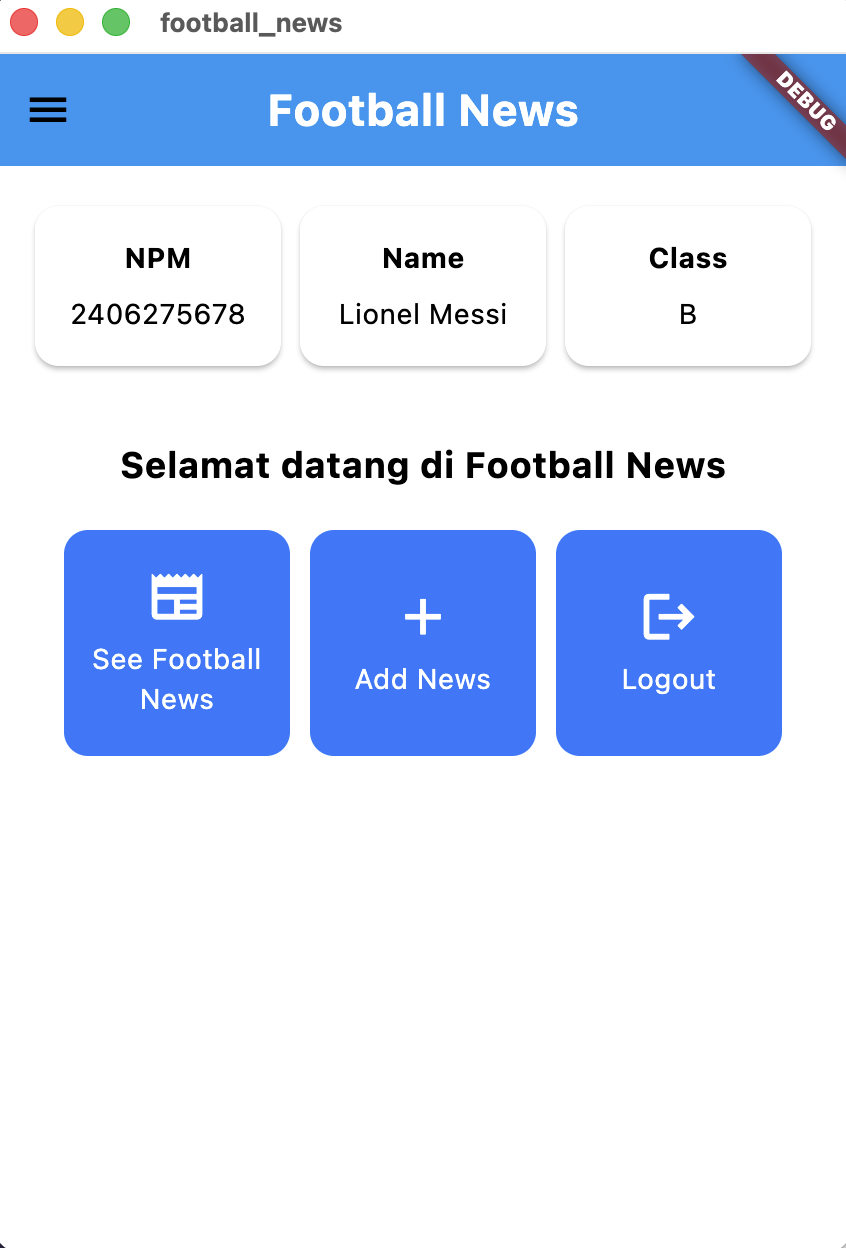
Try running your program, use the form you have created, and observe the result.
After following the instructions above, your app should look like this:
Don’t forget to complete all remaining TODOs before submitting the tutorial (the submitted tutorial must not contain any TODOs). Also, make sure to add the drawer to the NewsFormPage once that page has been created.
Tutorial: Adding Navigation Features to Buttons
Up to this point, we have successfully created a drawer that can navigate to other pages in the application, as well as a form page. In the previous tutorial, we also created three button widgets that can perform certain actions when pressed. Now, we will add navigation functionality to those buttons so that when pressed, the user will be shown a different page.
-
In the
ItemCardwidget insidemenu.dartthat was created in the previous tutorial, we will modify the code inside theonTapattribute ofInkWellso it can navigate to another route (add the code below theScaffoldMessengercode that displays the snackbar)....
// Responsive area for touch
onTap: () {
// Show SnackBar when clicked
ScaffoldMessenger.of(context)
..hideCurrentSnackBar()
..showSnackBar(SnackBar(
content: Text("You pressed the ${item.name} button!")));
// Navigate to the appropriate route (depending on the button type)
if (item.name == "Add News") {
// TODO: Use Navigator.push to navigate to a MaterialPageRoute that contains NewsFormPage.
}
},
...Note that for this button, we use
Navigator.push()so the user can press the Back button to return to the menu page. Additionally, if we useNavigator.pop(), the code can return to the menu page programmatically. -
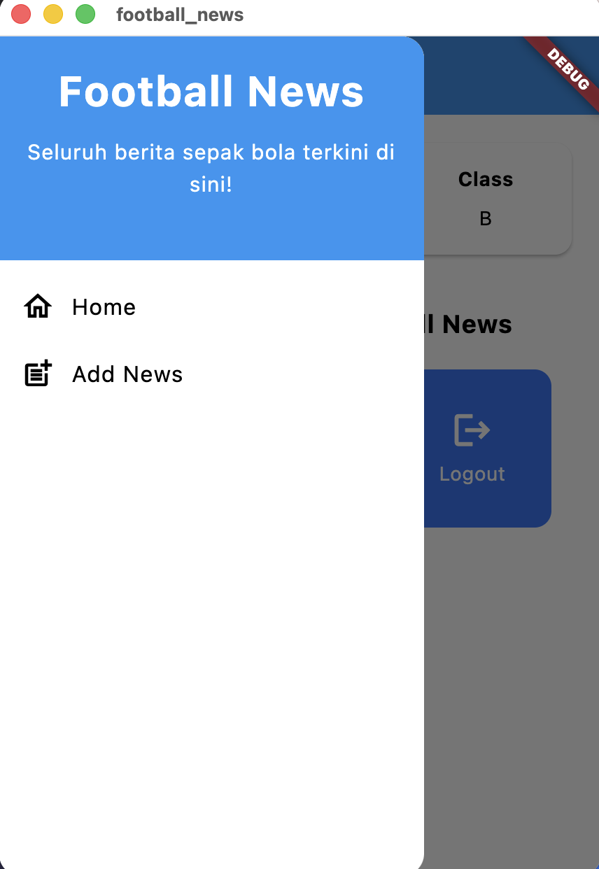
Try running your program, use the button that has been made functional, and observe what happens. Compare this behavior to navigation via the drawer (after finishing all TODOs in the drawer).
Don’t forget to complete all remaining TODOs before submitting the tutorial (the submitted tutorial must not contain any TODOs). Also, make sure to add the drawer to the NewsFormPage once that page has been created.
After following the instructions above, your webpage should look like this:
Tutorial: File Refactoring
After creating the newslist_form.dart page, our project now has more pages. Therefore, let's move the pages we have created into a screens folder to make our structure cleaner moving forward.
-
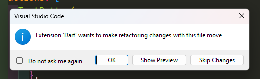
Before starting, make sure you already have the Flutter extension installed in your IDE or text editor.
-
Create a new file named
news_card.dartinside thewidgetsdirectory. -
Move the contents of the
ItemCardwidget frommenu.dartinto thewidgets/news_card.dartfile. -
Make sure to import
newslist_form.dartin thenews_card.dartfile and importnews_card.dartin themenu.dartfile. -
Create a new folder named
screensinside thelibdirectory. -
Move the
menu.dartandnewslist_form.dartfiles into thescreensfolder.
Make sure to move the files using an IDE or text editor that has the Flutter extension or plugin, and not through a regular file manager (such as File Explorer or Finder). This ensures that your IDE or text editor can perform automatic refactoring.
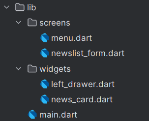
After the file refactoring is completed, the structure of the lib directory should be as follows.
Final Words
Congratulations! You have completed Tutorial 7! Hopefully, this tutorial helped you understand navigation, forms, input, and layouts well. 😄
-
Review and fully understand the code you wrote above. Don’t forget to complete all the TODOs!
-
Run
add,commit, andpushto update your GitHub repository.git add .
git commit -m "<commit_message>"
git push -u origin <main_branch>- Replace
<commit_message>as you like. Example:git commit -m "finished tutorial 7". - Replace
<main_branch>with the name of your main branch. Example:git push -u origin mainorgit push -u origin master.
- Replace
Additional References
Contributors
- Valentino Kim Fernando (SOY)
- Clarence Grady (GRD)
- Malvin Scafi (UMA)
- Danniel (DAN)
- Grace Karina (GAE)
Credits
This tutorial was developed based on PBP Odd Semester 2025 and PBP Odd Semester 2024, written by the Teaching Team and Teaching Assistants of the Platform-Based Programming course in 2025 and 2024. All tutorials and instructions in this repository are specifically designed to help students enrolled in the Platform-Based Programming course complete the tutorials during their lab sessions.